Underwear packaging serves a dual purpose: it must protect a delicate, personal item while simultaneously communicating brand values, hygiene, and style.
Improving your design requires a shift from viewing packaging as a mere container to seeing it as a physical touchpoint of the brand’s identity. To create a design that resonates with a broad, diverse audience, you must balance aesthetics, sustainability, and functionality.
The Core Pillars of Modern Underwear Packaging
To improve your current strategy, you must first understand the primary categories where design often fails or succeeds. Most consumers decide whether to purchase an item within seconds of seeing it on a shelf or screen.
1. Material Selection and Sustainability
The days of flimsy, single-use plastic bags for undergarments are fading. Today’s consumers are hyper-aware of environmental impact. Switching to recycled cardboard, FSC-certified paper, or compostable bioplastics immediately elevates the perceived value of the product.
2. Visual Storytelling and Minimalism
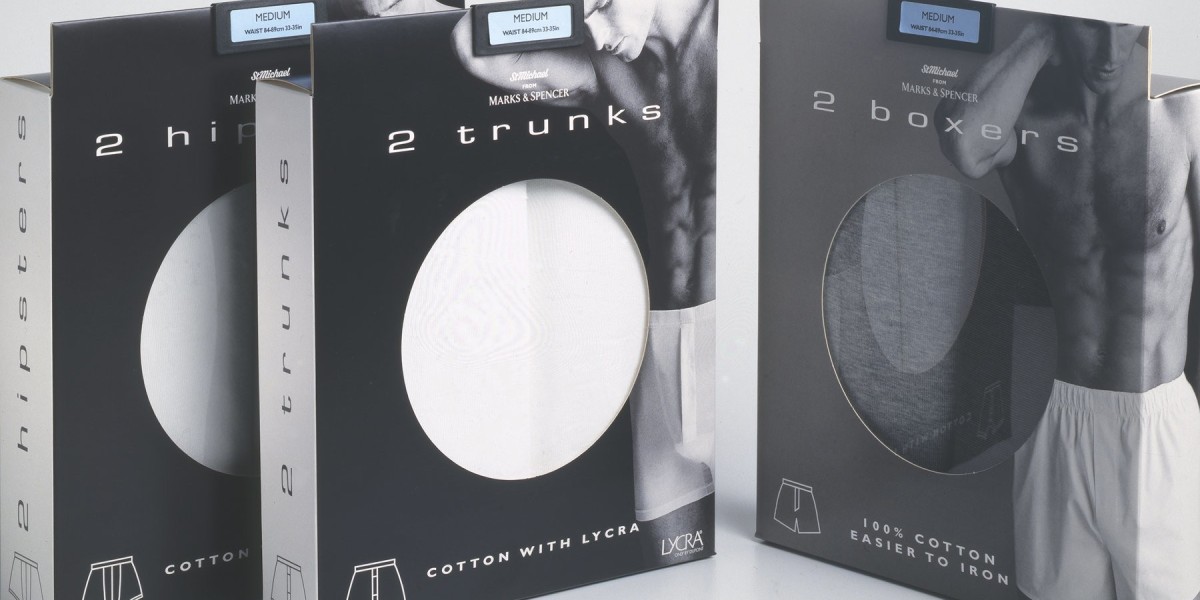
A cluttered box is a confusing box. High-end underwear brands have moved toward a minimalist aesthetic—clean typography, ample white space, and a focused color palette. The goal is to make the customer feel that the product inside is sophisticated and clean.
3. Tactile Feedback
Since underwear is all about the "hand-feel" of the fabric, the packaging should reflect that. Using soft-touch lamination, embossing, or even a small "peek-a-boo" window allows the customer to connect with the texture of the cotton, silk, or modal without compromising the hygiene of the garment.
 Design Features for Universal Appeal
Creating a design that "everyone" likes is a challenge in subjectivity, but universal design principles can bridge the gap. By focusing on inclusivity, ease of use, and honesty, you can create a package that appeals to a wide demographic.
Strategies for Improvement:
Inclusive Sizing Representation: Instead of using highly edited, stereotypical body types on the box, utilize abstract illustrations or diverse photography. This makes the brand feel accessible to everyone, regardless of their shape or size.
Frustration-Free Opening: No one wants to hunt for scissors to open a pair of briefs. Incorporate tear strips or magnetic closures. This adds a "premium" feel while improving the user experience for those with limited dexterity.
The "Second Life" Concept: Design the packaging so it can be reused. A sturdy, sliding drawer-style box can be used to organize socks or travel items, keeping your brand in the customer's home long after the initial purchase.
Color Psychology: Move away from gender-normative colors (like strictly pink for women or navy for men). Use sophisticated neutrals, earthy tones, or vibrant, energetic oranges and teals to create a modern, unisex appeal.
Summary of Packaging Improvements
The following table highlights the transition from "Standard" to "Optimized" design elements.
| Feature | Standard Design | Optimized Design |
| Material | Clear PVC/Plastic | Recycled Cardboard / Kraft Paper |
| Closure | Tape or Glue | Magnetic Flap or Tear Strip |
| Graphics | High-Gloss, Cluttered | Matte Finish, Minimalist |
| Sustainability | Disposable | Reusable or Home-Compostable |
| Information | Small, hard-to-read text | Clear icons for fabric and fit |
Enhancing the Consumer Connection
When a customer holds your underwear packaging, they should immediately understand the "why" behind your brand. Here are the specific areas where you can refine the design to ensure it stands out in a crowded market:
Transparency and Honesty
The packaging should never be a mystery. Clearly state the fabric composition and the country of origin. If the underwear is "seamless" or "moisture-wicking," use bold, easy-to-read icons rather than long paragraphs of text. People appreciate brands that value their time and provide information at a glance.
The Power of the Inner Message
Improve the interior of the box. Printing a small "Thank You" or a brand mantra on the inside flap creates a moment of delight when the box is opened. It is an inexpensive way to build brand loyalty and encourage social media "unboxing" shares.
Size and Storage Efficiency
Retailers love packaging that stacks well, and consumers love packaging that fits easily into a shopping bag. Avoid oversized boxes that contain mostly air. A compact, snugly fitted box suggests efficiency and respect for resources.
Critical Checkpoints for Your New Design
As you move into the prototyping phase, keep these bullet points in mind to ensure your underwear packaging meets the highest standards of modern retail:
Durability: Ensure the corners don't crush during shipping; a damaged box suggests a damaged product.
The "Click" Factor: If using a lid or a drawer, ensure the fit is tight enough to feel high-quality but loose enough to open smoothly.
Typography: Use sans-serif fonts for a modern look, ensuring the font size for "Size" and "Fit" is prominent.
Sensory Details: Consider a signature scent (very subtle) or a specific paper texture that matches the "vibe" of the fabric (e.g., rougher kraft paper for rugged cotton, smooth silk-finish paper for luxury items).
Digital Integration: Include a small, discreet QR code that leads to a styling guide, a recycling map, or a discount for their next purchase.
Conclusion
Improving your underwear packaging is a journey toward simplification and sustainability. By removing the "noise" of traditional retail—excess plastic, crowded graphics, and gendered stereotypes—you create a vessel that feels premium and thoughtful. When you prioritize the user's tactile experience and the planet's health, you create a design that isn't just "liked" by everyone, but respected by them.
The goal is to make the customer feel that the care put into the box is a direct reflection of the care put into the garment itself.